
Reference: Dong E, Du H, Gardner L. An interactive web-based dashboard to track COVID-19 in real time. Lancet Infect Dis; published online Feb 19. https://doi.org/10.1016/S1473-
Who started the dashboard?
Professor Lauren Gardner, a civil and systems engineering professor at Johns Hopkins University, built the dashboard with her graduate student, Ensheng Dong. It is maintained at the Center for Systems Science and Engineering at the Whiting School of Engineering, with technical support from ESRI and the Johns Hopkins University Applied Physics Laboratory. Gardner is co-director of the CSSE. Learn more about Gardner and her work.
When and why was this map started?
The map was first shared publicly on Jan. 22. It was developed to provide researchers, public health authorities, and the general public with a user-friendly tool to track the outbreak as it unfolds. All data collected and displayed are made freely available through a GitHub repository, along with the feature layers of the dashboard, which are now included in the ESRI Living Atlas. For a detailed explanation for the dashboard’s development, please refer to this article in The Lancet by Professor Lauren Gardner.
Is there an embed code for the dashboard?
Yes, but please provide credit by citing “Johns Hopkins University” or “Johns Hopkins Center for Systems Science and Engineering.” This is the embed code.
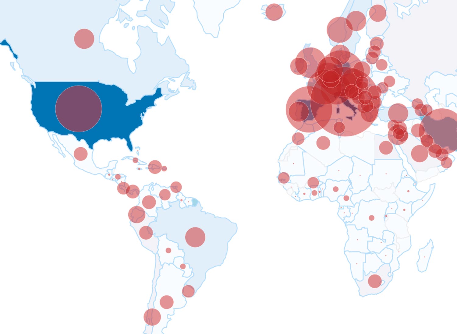
Why does the map report only state-level data in the United States instead of county-level data? In light of the increasing rate of cases being reported in the United States and worldwide, and in order to retain timeliness and accuracy, the map switched from reporting at the county level to the state level on March 10. The team expects to return to county-level reporting once it feels confident the platform can provide the most accurate, timely reports from local jurisdictions as the virus rapidly advances.
Why is a point on the map located on my city or neighborhood?
All points shown on the map are based on geographic centroids, and are not representative of a specific address, building or any location at a spatial scale finer than a city. Click on each point on the map to obtain information associated with each reported case. When the map is reporting state-specific data, the points are located in the center of each state. When the map is reporting county-specific data, the points are placed precisely at the geographic center for those jurisdictions.
Can the dashboard’s data be used by my business or government agency? If you are a government agency, you may use the data for your purposes so long as you provide credit. All data, mapping and analysis (website, copyright 2020 Johns Hopkins University, all rights reserved) is provided to the public strictly for educational and academic research purposes. Screen shots of the website are permissible so long as you provide appropriate credit.
How often is the dashboard information updated?
The map is maintained in near real time throughout the day through a combination of manual and automated updating. The time of the latest update is noted on the bottom of the dashboard. The GitHub database updates daily at around 11:59 p.m. UTC. Occasional maintenance can result in slower updates.
What are the sources of data informing the dashboard?
The data sources include the World Health Organization, the U.S. Centers for Disease Control and Prevention, the European Center for Disease Prevention and Control, the National Health Commission of the People’s Republic of China, local media reports, local health departments, and the DXY, one of the world’s largest online communities for physicians, health care professionals, pharmacies and facilities.
Where is the location for the U.S. passengers from the Diamond Princess cruise ship?
All COVID-19 cases in repatriated U.S. citizens from the Diamond Princess are grouped together at the location of the ship’s port off the coast of Japan.
What is the most recent traffic for the dashboard?
Feature requests per day on the dashboard have grown from about 200 million in late January to 1.2 billion daily requests in early March. A “feature request” represents the number of times visitors have accessed the underlying data while visiting the dashboard.
Does the dashboard have data on age, gender, nationality, and other demographic information?
No.
How did the team decide on the names of nations?
Initially the map followed the naming scheme used by the World Health Organization. It then switched to names of nations designated by the U.S. State Department.
Is the map copyrighted?
The website and its contents, including all data, mapping, and analysis, copyright 2020 Johns Hopkins University, all rights reserved, is provided to the public strictly for educational and academic research purposes.
Why does data here differ from data on other websites?
The website relies upon publicly available data from multiple sources that do not always agree. More frequent updates of the map often result in higher case numbers than may be available from other sources that are updated less frequently.
Does the website provide medical guidance?
Reliance on the website for medical guidance or use of the website in commerce is strictly prohibited. The Johns Hopkins University hereby disclaims any and all representations and warranties with respect to the website, including accuracy, fitness for use, and merchantability.
Has the map contained any malware?
No. Johns Hopkins University has learned about the existence of malware designed to look like the university’s coronavirus tracking map in an effort to steal information from users who visit the fake site. The Johns Hopkins COVID-19 map on the university’s website does not contain malware and is safe to navigate. The malicious application requires users to download software or launch the fake map, which opens the malware. The Johns Hopkins dashboard is hosted by Esri as part of its ArcGis Online offering. According to Esri, “a malicious person created a Windows-based application containing malware whose display is practically identical to the Hopkins dashboard.” If you receive an email containing a link to download such an item or come across the code for the malicious app please report it immediately to the Esri incident response team through ArcGIS Trust Center security concern page.
Who can I talk to for more information about the dashboard or to speak with Professor Gardner?General questions about the map should be directed to COVID19map@jhu.edu. Members of the media with questions should contact the Johns Hopkins University Office of Communications at 443-997-9009 or at jhunews@jhu.edu.